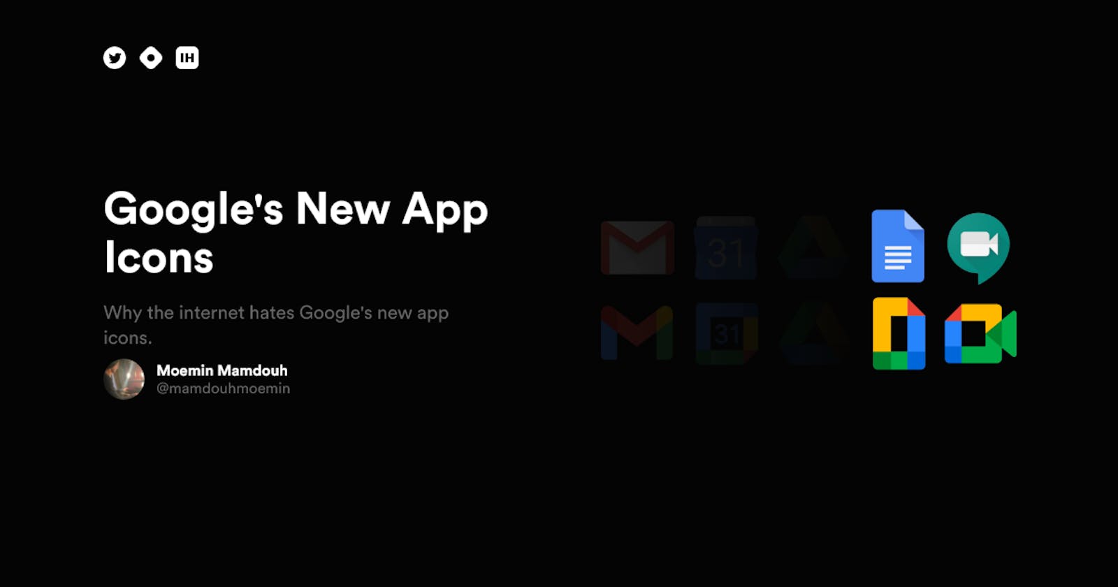


Google's new app icons are, well, a massive disappointment. They are so bad, there's a Chrome extension that you can download to restore the old icons. Design changes are always met with some sort of backlash, that's understandable, people don't like change. Facebook's desktop redesign, Instagram's icon redesign, Macbook's touchbar, etc. The problem here; however, revolves around usability, and that's when user feedback should be seriously taken into consideration.
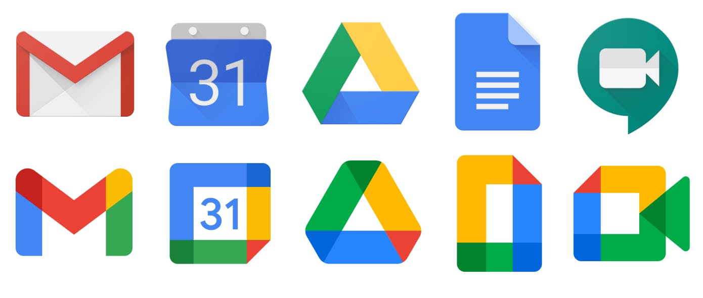
Aside from the icon's shapes, there is nothing else distinguishable about them. They are all made from a palette of four colors; blue, green, yellow, and red. There's a reason why people hate them, and it's not colors, it's usability.
Browsing through the internet, here are some common complaints:
I had to manually change every Google app icon on my Android phone. I had trouble finding the Maps icon even though it is in the same place. All the new icons look similar to Google drive icon.
The complaints all revolve around not being to find the apps they want to launch.
Bring back the old version. Like the new icons aren't even close. They're so unrecognizable that when I go search for them, I forget what I'm looking for before I get to them. It takes me 3 tries to create new events in my calendar or check my email lol
I believe this comment summarizes why this change rolled out and is live
To me, this is a symptom of a large company with lots of internal politics and friction, where it is not safe for a designer to push back and say "no, this is not a good idea" to their manager.
Or, even more likely, someone did, and were forced to execute anyway.
Unfortunately, this is the current state of UX and Design in a lot of companies. Stakeholders are ultimately the one making decisions despite being met with proven statistics from designers.
I also feel like this is a great lesson to any aspiring designer that working for FANG companies isn't always rainbows and sunshine. I can't be sure why these icons rolled out, if it actually was internal politics or not, but it does happen. It isn't always about working for FANG companies, but working for a company that aligns with your values.
See you in another Google rebrand.