Overview
Stacks is a product that is meant to accelerate e-commerce building through the automation of a number of tasks. The platform launched in 2018 and has since gained a lot of loyal customers.
However, Stacks lacked online presence and mainly relied on word of mouth to gain customers. Moreover, it lacked any of the automation it promised. The aim of this project is to create an entire website that coincides with what Stacks is going to deliver, as well as redesign the actual platform.
Role
Lead Product Designer. Information Architecture, Usability Testing, User Research, Prototyping, reiteration.
The Problem
👉 Information Architecture led to confusion among prospect customers.
👉 No free trials offered. (Difficult to convince customers to try out a service priced at $39 in one go).
👉 Inconsistent visual language.
👉 Promised automation, but everything was done manually by support team leading to higher wait times and clogged queue.
👉 Difficult-to-use platform.
Information Architecture
Tackling the first problem (Information Architecture) was high on the priority list. Here's a rundown of what caused confusion among prospect customers on Stacks. Stacks offered two products, Plates and Outlets. Plates is a theme for restaurants, while Outlets was a theme for e-commerce websites. People would subscribe to these products instead of Stacks. Pretty easy to understand, right? Perhaps on paper, but the implementation was what caused the confusion.
This is called Polyhierarchy. Seemingly different products are listed multiple times in multiple locations eventually causing confusion.
Each of Plates and Outlets had their own landing page, with their own pricing (both at $39) — so then, why would each have their own landing page? And had Stacks added more products, would each have their own landing page as well? It just simply did not make any sense.
👉 The proposed solution was as follows: People are subscribing to Stacks, not the themes it offers. There should be only one landing page for Stacks, and after subscription, people are given the choice between Plates, Outlets, and any other future product Stacks will offer. In a simple wireframe, this is what it would look like after subscribing to Stacks.

Lack of Free Trial
At such a steep price ($39), it makes sense to have the users try out the service before financially committing. Previously, Stacks did not have this option. After some discussion, we added a 2 week free trial.
Problems Tackled and Results
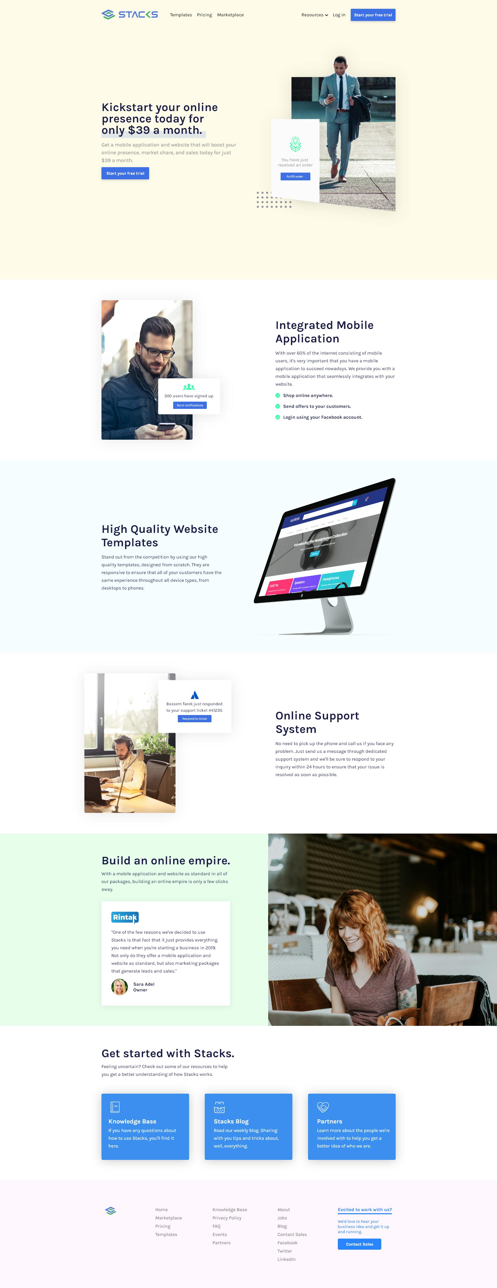
Here was the proposed re-design for the website after tackling the below problems.
👉 Information Architecture
👉 Lack of Free Trial
👉 Inconsistent visual language.
Results were great. We saw a 440% increase in trials. We had previously added a free trial option in the old design, but that only got around ~5 trials per day. With the new design, we started getting around ~27.
People were now less hesitant to start a free trial with the new redesign. Mission successful!

Onboarding Insights
🚀 Onboarding Matters
Onboarding Matters. It should be obvious, but here are is some data to confirm the statement.
👉 40% increase in retention rate after implementing onboarding. 👉 47% from 83% bounce rate.
⌛ Keep 'em loading
Skeleton loading and loading screens, they're there for a reason.
👉 23% of survey participants wanted something to keep them entertained while we uploaded their products.
⚙️ Full Automation or no Bueno
Despite adding onboarding and some automation, users still did not feel like performing manual actions when needed (due to budget constraints). It was apparent they wanted full automation of all tasks involved in creating the e-commerce website as well as the mobile application.
